

Reader’s Digest
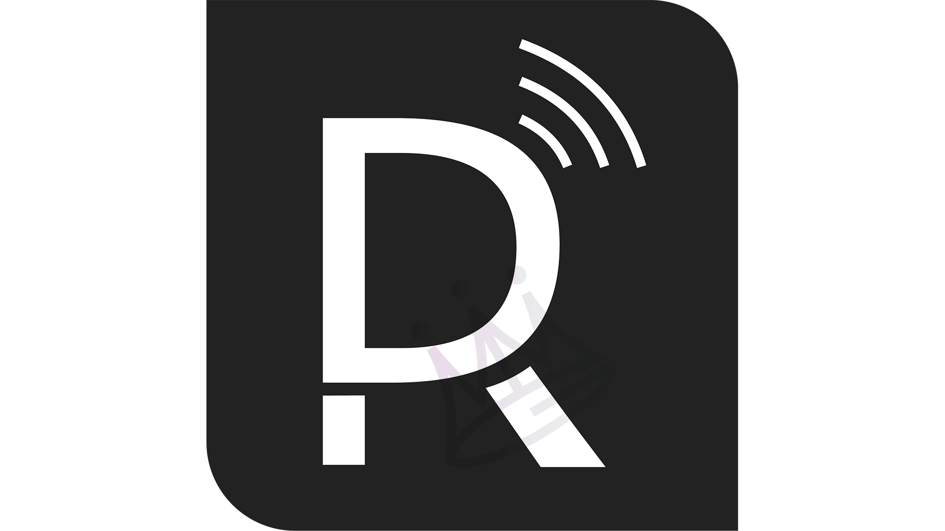
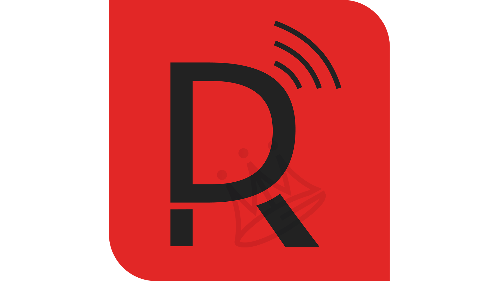
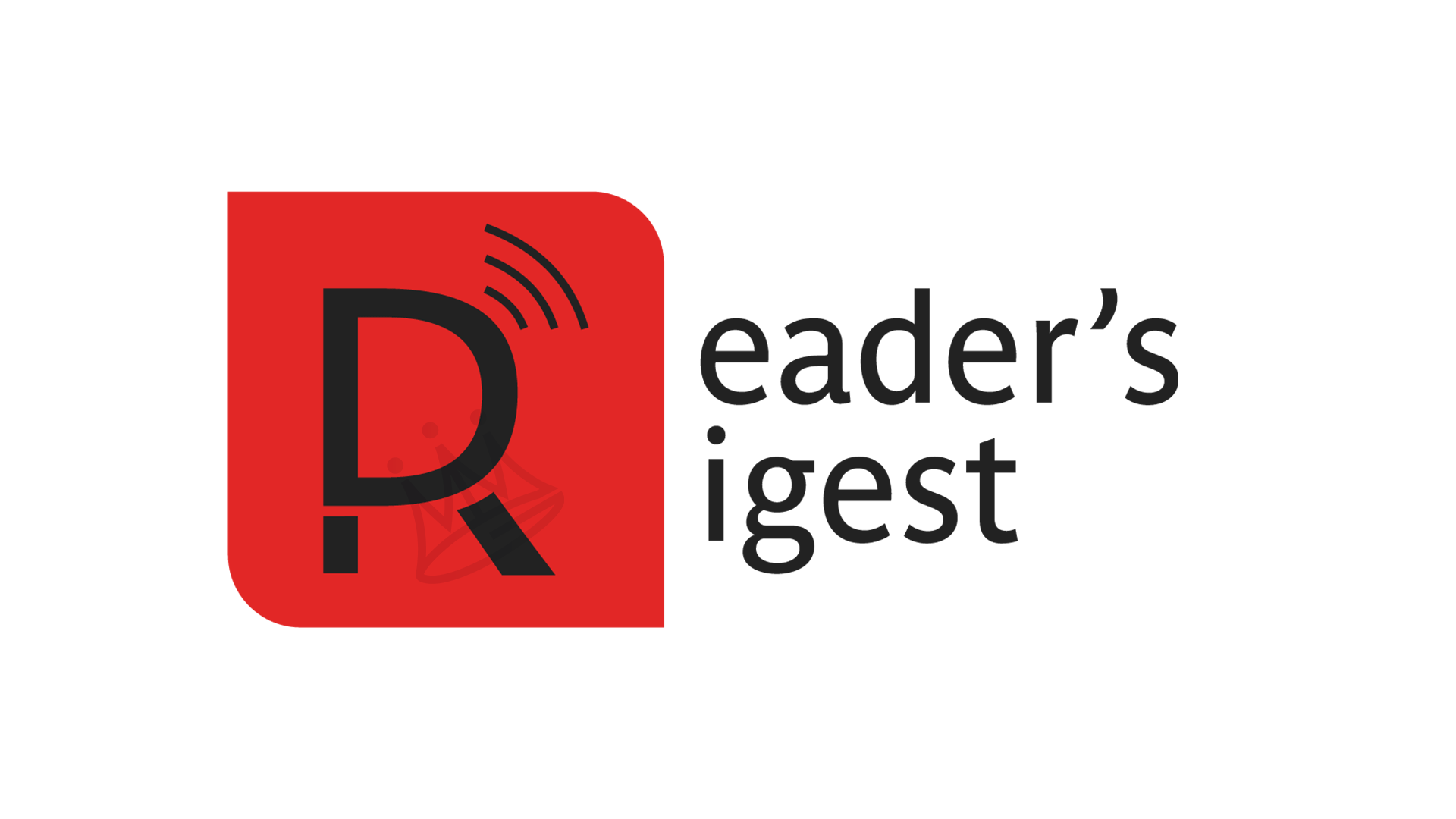
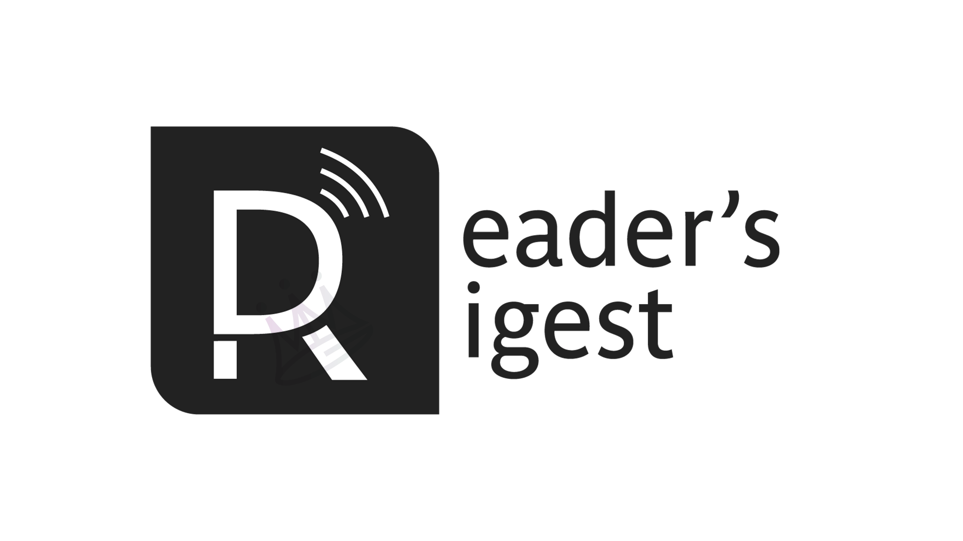
Reader’s Digest has been known as a reputable condensed informational general interest magazine established in 1992. While being considered groundbreaking journalism then, we now live in an era where we gather information off the internet; therefore, their logo was updated to display the concepts of wireless communication.
The radiating lines protruding from the lettermark resemble that of a Wifi symbol, insinuating the fact that Reader’s Digest has indeed kept current by going digital. Sans serif Parasine Standard font was used to keep a modern look to the newly designed combination logo, which could be used across publications or as a single icon for both branding and digital use.

Original Reader’s Digest Cover, Sept. 2017

Rebranded Combination Lettermark